Open Source Datasets
Some of the datasets I really find interesting:
World
Varieties of Democracy: This dataset has country-by-year information with different democracy indices and disagregated data on minority representation, the rule of law, labor rights, voting rights, civil liberties and other dimesnions of democracy.
World Inequality Database: Country-by-year dataset with information about wealth and income inequality. If you are a Stata user, you can access the data directly from Stata by installing wid command: ssc install wid .
World Bank: This is a rich dataset with several indicators on education, health, labor and poverty by country. It also has the Doing Business indicator and the Millenium Development Goal. You can access aggregate data by country or microdata for each specific country (when available).
Our World in Data. COVID-19 Dataset: Daily updated dataset with country level information on COVID-19 cases, deaths and tests. It also includes demographic information for each country.
Human Freedom Index: Starting in 2008, The Human Freedon Index dataset has information on on personal, civil, and economic freedom.
Chile (Spanish)
Department of Education Open Data: These are administrative records on
students' performance, admission, and attendance at different education levels, from pre-K to higher education, since the early 2000's.
It also has information on schools and teachers. These are very complete and clean datasets.
They have separete datasets for each year, but merging them is very straightforward. I have a complete dataset where I merged most of the information, I am
happy to share it with anyone who ask!
Unemployment Insurance, Chile: Sample of up to 12% of workers in the Unemployment Insurance records. These are monthly observations with personal, income, employment, and occupation characteristics.
Data Visualization Resources
I am not an expert in data visualization, but, lucky me, there are tons of information publicly available. Here are some of the resources I find useful and/or cool.
What the graph
After figuring out how I want my graph to look like, I usually start by searching the name of the graph I need (or the closest one). Dataviz Project has a neat catalog of different types of graphs. And it has cool examples too.
PolicyViz also has nice examples of data visualization from different sources. Definitely something to check if you are not sure how to present your results or need some inspiration. They also have a podcast!
How to do it
Once I have the name of the graph, I always have to check how to do it in R, Python, or Stata. For this purpose, the R graph gallery is always a good place to start. Rob Kabacoff has an open-access Data Visualization with R book that is simple and intuitive. Very helpful. The Python Graph Gallery is a good place to look if you prefer Python. Finally, Plotly also has a nice catalog of graphs for Python, R, and JavaScript.
Data Visualization on Random Topics
Human Rights
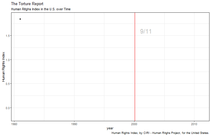
Human Rights in the US
Many times, basic human rights are sacrificed for the sake of safety.
Collective Bargaining, GDP, and Inequality
Almost every country that sets their minimum wage through collective bargaining is in the high growth, low inequality quadrant.
Check this interactive graph to see the relationship between inequality and GDP. On the horizontal axis, I plot the Gini coefficient for 2011 (Gini = 1 implies complete inequality, Gini = 0
means perfect equality). On the x-axis, I plot 2011 GDP.
I use information from the World Bank for the Gini coefficient, GDP, and population size. The minimum wage information is from the
WORLD Policy Analysis Center
at UCLA.
Poverty
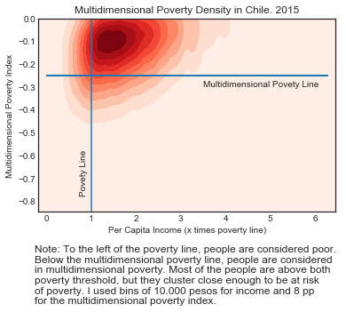
More than Meets the Eye
In 2019, Chile experienced several social protests demanding a better quality of life (among other things).
While many experts and politicians argued these protests were unfounded because the inequality level and the poverty rate were historically low,
more and more people joined the movement and raised their voices in complaint. Let this help us remember that any measure we use will be necessarily incomplete.
This graph shows the density of families in Chile along two dimensions: income and a multidimensional poverty index. This index uses 12 different
indicators grouped in 4 dimensions: labor, education, housing, and health.
Although the poverty rate was low, many families were just above the poverty line and lacking in at
least two of these indicators. In other words, they were highly vulnerable. This didn't appear in the official measures.
Education
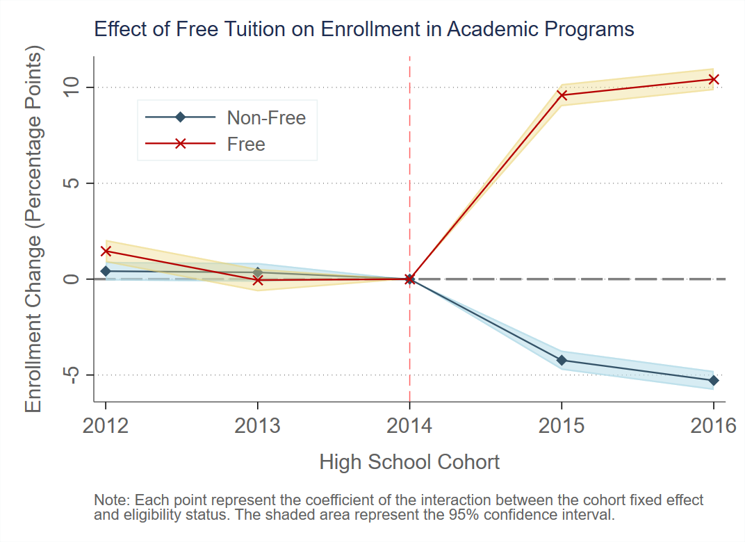
Effect of a Free-Tuition Policy in Chile
In 2016, Chile implemented a free-tuition policy for the poorest 50% of the population. This graph shows the enrollment change of eligible students, relative to non-eligible students, before and after the policy. The first high school cohort to benefit from this policy was 2015. Eligible students were around 10 percentage points more likely to enroll in an academic program in a free institution, and around 50% of them would have enrolled in an academic program in a non-free institutions.
These point estimates and confidence intervals come from a difference-in-difference estimation with a correction for sample selection.